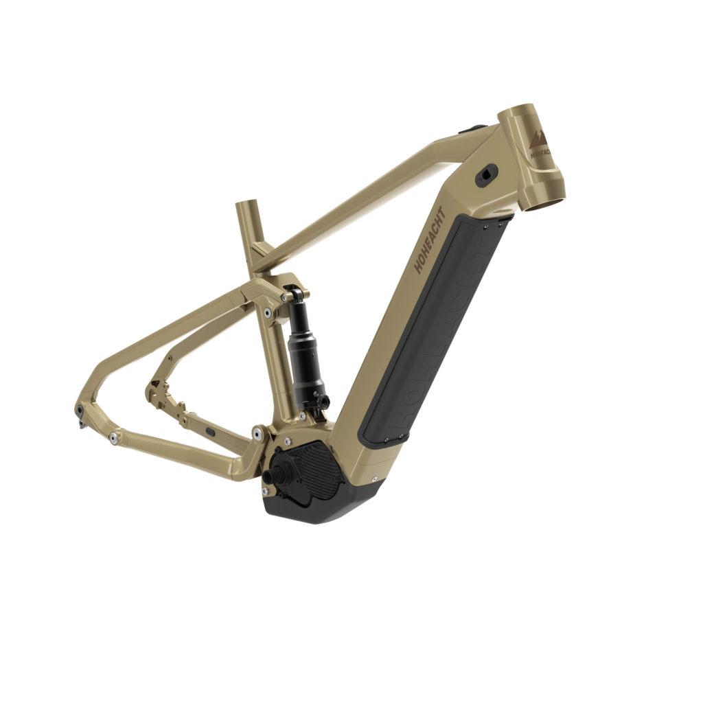
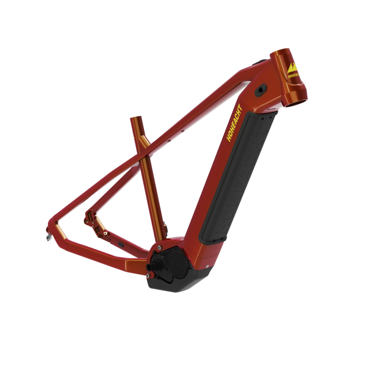
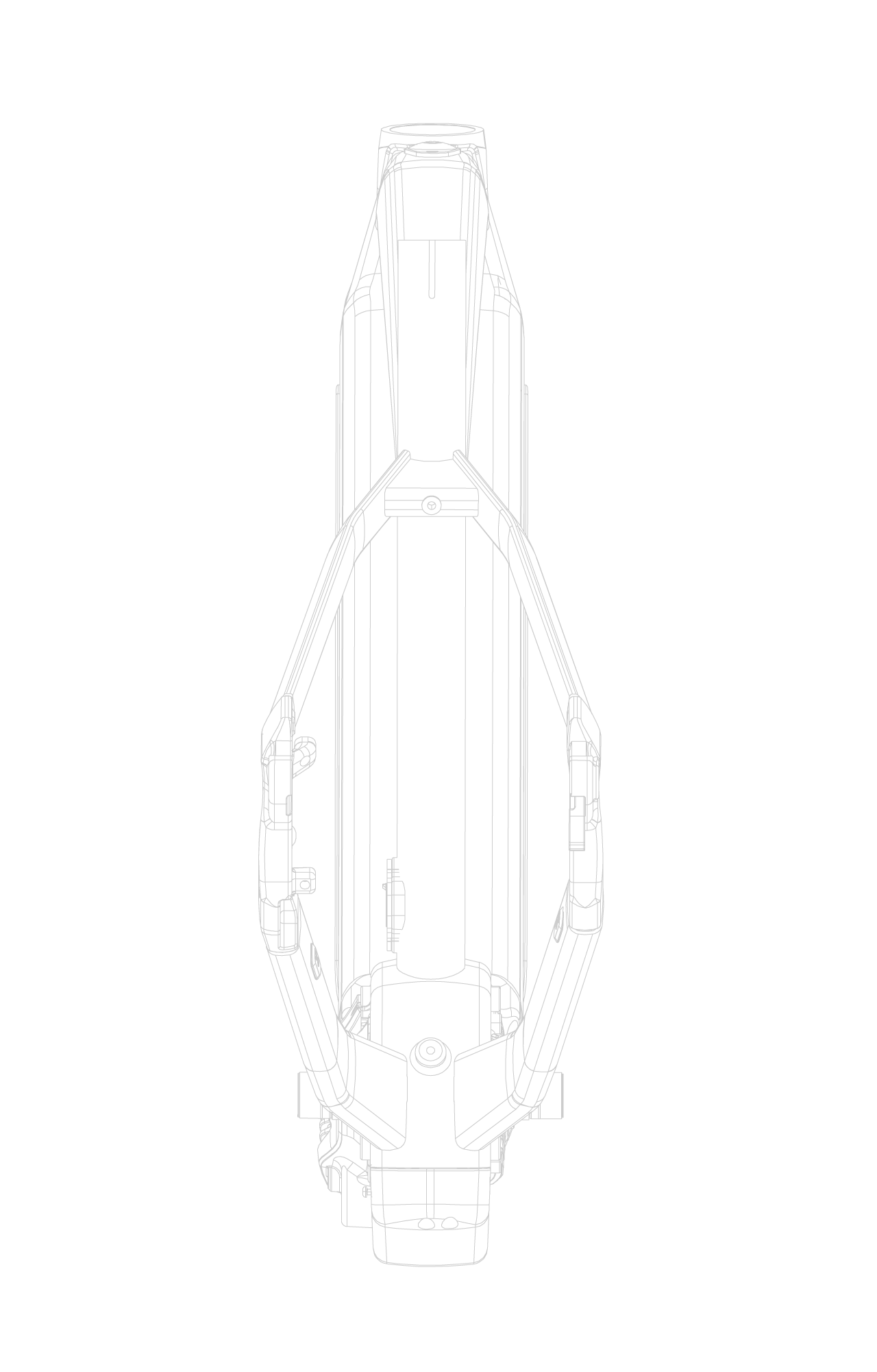
The new formed german e-bike band Hoheacht from the Eiffel region inquired me to develop a full corporate identity for their market launch, including logo, visualizations, frame colors and decals. In a wide reaching research, we analyzed the brand’s roots, in the heart of the volcanic Eiffel. Since the brand’s name is referring to the highest mountain in the region, it seemed natural to use this touching point for the logo development. After many iterations, the final logo merges the power of the e-Bike with the volcanic root of the brand. Based on the brand’s background, the color range for the bikes has been developed around grounded colors and earth tones. This work included all the frame coloring as well as the decal development frame artwork and positioning. In addition to the development process, many visualizations in 2D and 3D have been created for the product launch, campaigns and catalogs.
The new formed german e-bike band Hoheacht from the Eiffel region inquired me to develop a full corporate identity for their market launch, including logo, visualizations, frame colors and decals. In a wide reaching research, we analyzed the brand’s roots, in the heart of the volcanic Eiffel. Since the brand’s name is referring to the highest mountain in the region, it seemed natural to use this touching point for the logo development. After many iterations, the final logo merges the power of the e-Bike with the volcanic root of the brand. Based on the brand’s background, the color range for the bikes has been developed around grounded colors and earth tones. This work included all the frame coloring as well as the decal development frame artwork and positioning. In addition to the development process, many visualizations in 2D and 3D have been created for the product launch, campaigns and catalogs.