The interaction of human, object, and environment forms the basis of my work.
POWER PLACE
reseach | product development | art direction
The project explores the daily need for electricity in our living space. Its purist design language is paired with a technological inside, making it a hybrid that represents a new category of furniture. The object combines extension cable, portable battery, storage space and a variety of charging interfaces in one organized object.
ORGANICO
reseach | product development | art direction
The multiple awarded project explores hemp as a renewable resource for the development of a circular material. A self developed bio adhesive, is used to press hemp fibers and hemp shives into a sandwich material. This structure translates the natural composition of the plant into a technical lightweight structure and results in a material that is both stable and light.
PELLTA ONE
3D modeling | brand identity | product development
For the Berlin tech-startup Pellta I developed the product and brand identity. For over three years, and helped to shape the brand’s identity by a clear product design and a strong visual language with high quality visualizations in the pre-launch phase. In close collaboration with the team, I developed the logo design and a serious visual identity.
IONIQ SKINCARE
visualization | brand identity | 3d-art
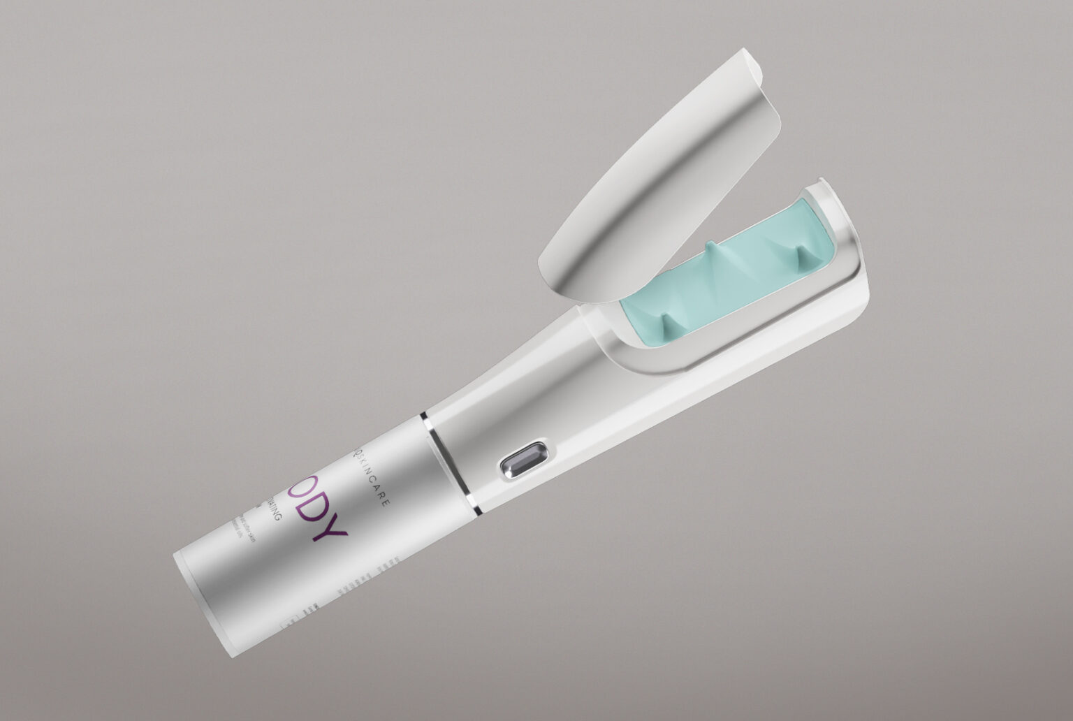
For the visionary beauty brand IONIQ Skincare a unique set of high quality 8K renderings of there IONIQ-ONE have been created. The device uses the natural magnetism of skin, for a smart skincare application system. Together with Paula_Crayon I realized a set of futuristic corporate worlds, tailored to each product. The resulting images underline the future oriented spirit of the brand and promote the device in a unique environment.
NOMNOM
sustainable | product development | reseach
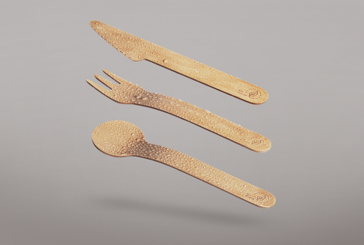
NomNom is a durable, ecological cutlery. The project was a response to the ban of disposable plastic cutlery by the EU in 2021. A purely biological coating makes the object’s water-repellent and more stable. The extremely resistant coating results in the possibility to clean the cutlery and use it several times. All objects are biodegradable.
HOHEACHT
branding | corporate identity | visualization
The new formed German e-bike band Hoheacht from the Eiffel region inquired me to develop a full corporate identity for their market launch, including logo, visualizations, frame colors and decals. In a wide reaching research we analyzed the brands roots, in the heart of the volcanic Eiffel. Since the brands name is referring to the highest mountain in the region it seemed natural to use this touching point for the logo development.
Native
3D modeling | visualization | packaging
Native is an organic skincare brand that reminds us on our origins. The brand identity has been developed by Paula_Crayon. I have been asked to support the project from an industrial design perspective and evaluated the bottle design till the mold making and the first prototypes. Furthermore, I developed the lid and its opening mechanism, including CAD modeling and prototyping.
Cooper Bikes
branding | corporate identity | research
Cooper Bikes is an innovative bike brand from London. The bikes hide a complete e-bike drive system in the rear wheel hub, build around recuperation. For the launch of a new product line I helped the brand to reposition in the fast changing bike market with a complete redesign of all frame colors and decals. Therefore we dived both in the bike trends and consumer trends to build a market oriented, modern brand.
Cerry Cup
3D modeling | visualization | packaging
Cherry-Cup is a menstrual cup that has been developed together with Paula_Crayon. Through the 3d printing the cup can be adjusted to the individual morphology of each woman which is essential for such a personal item. The design consists of two main parts; a funnel-shaped opening that ends in a small passage and a spherical container that can hold a high capacity of liquid. The project has been kindly supported by SpectroPlast.
Cell Protec
branding | corporate identity | research
An innovative packaging, developed for the Cofresco challenge „Paper+X“. Inspired by Chinese lanterns and paper garlands, the packaging protects food with a honeycomb structure from thin layers of paper. The packaging solution addresses the need for sustainable and protective fruit packaging, reducing waste and supporting environmentally conscious consumer habits. The design incorporates thin layers of paper which form a honeycomb mesh that gives it its protective effect.


